17 August 2017
Redesign of Zizzi.dk increases mobile conversion by 33%!
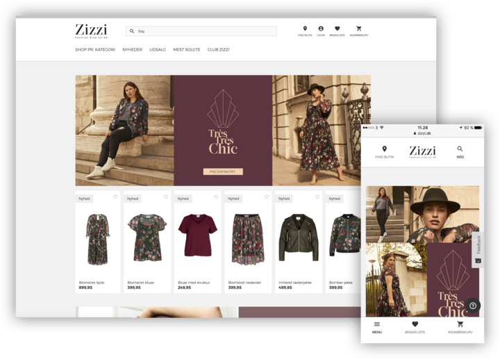
Zizzi, The Nordic countries’ largest chain within curvy fashion with more than 117 shops, has redesigned its webshop in cooperation with its regular e-commerce supplier, Hesehus, which already during the first month after the launch resulted in an increased mobile conversion rate of 33%.

Redesign
Two years after the launch of Zizzi’s international webshop, present in Denmark, Sweden, Norway, Finland and the Netherlands, it was time for a redesign of the solution in order to also get the visual expression up-to-date and use the entire width of the larger screens which most users have today. A redesign which, of course, is created in Bizzkit CMS and that is based on the e-commerce platform Bizzkit developed by Hesehus.
The Guru of Web Page Usability and principal at Nielsen Norman Group, Jakob Nielsen
”One of usability´s most hard-earned lessons is that ’you are not the user’. If you work on a development project, you´re atypical by definition. Design to optimize the user experience for outsiders, not insiders”
You are not the user
To identify the functional and converting features and find design elements with the opportunity to improve, Zizzi and Hesehus’s UX Design team decided to involve the target group directly through user tests of the former webshop. Through qualitative user tests in which Hesehus’s UX experts observed the navigation of the test persons round the site and listened to the thoughts behind their actions, Hesehus and Zizzi have obtained an even better insight into how the customers act and have therefore been able to optimise the webshop accordingly.
The results from the user test have been divided into three categories – high, average and low – based on the importance of improved user experience and all significant design and feature changes are, of course, split tested before final implementation.

Optimal user experience on mobile
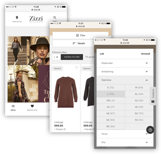
One of the biggest findings in the user test was the test persons’ experience of zizzi.dk on the mobile where, for example, the mobile menu did not function optimally. In the redesign, Hesehus and Zizzi have therefore created an easier and more user-friendly menu in which it has also been made clearer to the customer whether he/she is in a main or a subcategory. The search button has also been allocated a distinct icon and has been placed so that it is easy to find in the mobile menu and last but not least, in the redesign improvements have been performed in the filtering on the mobile where the filtering button has been made more visible and where the customers are now able to set up more filters at the same time in their search.
The changes to the redesign have resulted in an optimal user experience on the mobile and the customers have certainly repaid it by an increased conversion rate of nothing less than 33.14%.
Erik Stengaard-Pedersen, Head of E-commerce & Omni-channel at Zizzi
“Via the user test, we obtained really useful insight and got to know our customers and their online shopping patterns even better. Together with Hesehus, these have been optimally integrated in the new design which the strong conversion rate clearly shows. The result speaks for itself”
Improved sorting gives conversion boost of up to 20%
Another finding which the user test clearly indicated was that the test persons did not receive what they expected from the webshop’s sorting options. An example is that several of the test persons commented on the standard sorting where they could choose the sorting option 'Zizzi recommends'. Here it was expected to become inspired and tempted by products which Zizzi considered to be hot fashion wise and not, as was the case, basis products. Zizzi has now changed this in connection with the redesign by optimising the standard sorting with new options which meet the customers’ expectations which on average has provided a conversion improvement of 2.1% and a conversion boost of up to 20% dependent on the specific content.


3% increase in average order value with better size indication
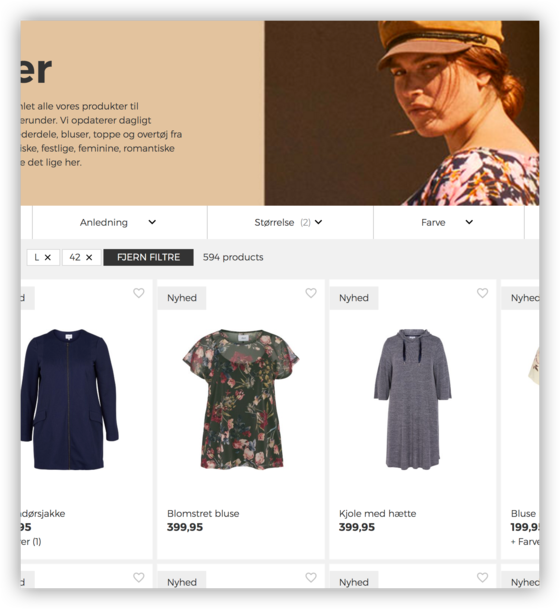
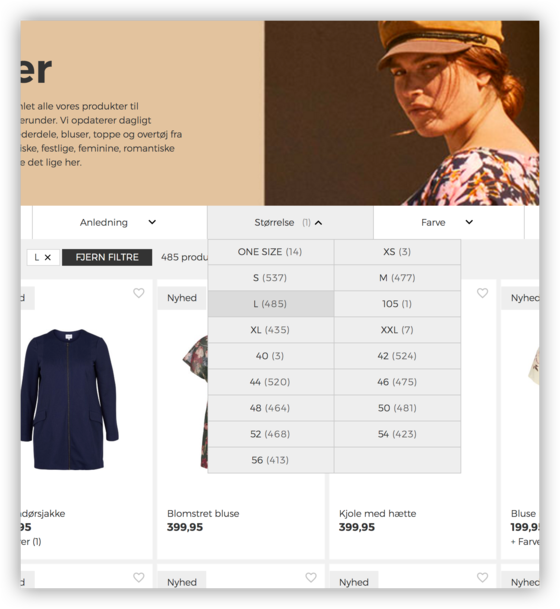
Zizzi’s product range operates with different sizes (e.g. S, M, L and 42, 46, 50). During the user test, it turned out that it confused the test persons when filtering as they were introduced to a list of options that they had not expected. In the webshop, Zizzi has a size table which explains the different sizes which meant that the test persons assumed that if they chose size “S” in the filtering, they would be shown products indexed as “42” and “44” (the corresponding sizes). However, such cross filtering was not made in the webshop and this meant that the test persons who searched for trousers in size 46 were not shown trousers that were indexed as M even though the trousers matched the actual size they were looking for.
This has been solved in the new redesign by a better mapping between the sizes allowing the products which match the size searched for to appear. This means that if a customer is looking for trousers in S, the trousers indexed as 42-44 are also included in the view. The improved mapping has resulted in a 3% increase in the average order value for Zizzi.
Read the case on Zizzi's international webshop.

Would you like to increase your conversion rate significantly? We would like to invite you for a cup of coffee or we can drop by for a non-binding talk.
Please contact CEO, Lars Hedal, at +45 40 25 50 83 or on e-mail hedal@hesehus.dk
More news