Case: Zizzi
Optimal UX increases conversion with 33%
Zizzi, The Nordic countries' largest chain within curvy fashion with more than 110 shops, has with an ambitious online strategy set the bar high; the webshop has to be market leading as Zizzi's physical shops are today.
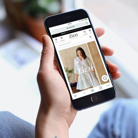
To accommodate Zizzi’s objectives, Hesehus has integrated optimal user-friendliness in all aspects of the shop in design as well as in the development - an optimal user-friendliness will optimize the sales and thereby increase the conversion. As a result, the webshop is developed in a responsive design allowing the customers who visit the webshop from, e.g. tablets or smartphones, to be met by the same high level of user-friendliness. The members of the customer club Club Zizzi can also log in with their club login and have the same advantages in the webshop as in the physical shops.
Unique insights through user surveys
Two years after the launch of Zizzi's international webshop it was time for a redesign of the solution in order to also get the visual expression up-to-date and use the entire width of the larger screens which most users have today. A redesign which, of course, is created in Bizzkit CMS and that is based on the e-commerce platform Bizzkit developed by Hesehus.
To identify the functional and converting features and find design elements with the opportunity to improve, Zizzi and Hesehus’s UX Design team decided to involve the target group directly through user tests of the former webshop. Through qualitative user tests in which Hesehus’s UX experts observed the navigation of the test persons round the site and listened to the thoughts behind their actions, Hesehus and Zizzi have obtained an even better insight into how the customers act and have therefore been able to optimise the webshop accordingly.
The results from the user test have been divided into three categories – high, average and low – based on the importance of improved user experience and all significant design and feature changes are, of course, split tested before final implementation.
Redesign increases mobile conversion by 33%
The changes to the redesign have resulted in an optimal user experience on the mobile and the customers have certainly repaid it by an increased conversion rate of nothing less than 33.14%.
Another finding which the user test clearly indicated was that the test persons did not receive what they expected from the webshop’s sorting options. An example is that several of the test persons commented on the standard sorting where they could choose the sorting option 'Zizzi recommends'. Here it was expected to become inspired and tempted by products which Zizzi considered to be hot fashion wise and not, as was the case, basis products.
Zizzi has now changed this in connection with the redesign by optimising the standard sorting with new options which meet the customers’ expectations which on average has provided a conversion improvement of 2.1% and a conversion boost of up to 20% dependent on the specific content.
Malene, blogger on Piece of my mind
“I think that it is much easier to navigate the webshop now– especially from my smartphone. It is so easy to take a quick look to see if there are some new, exciting products. That is often the case so of course it is quite tempting to 'just take a look”
Personalisation module increases conversion by 150%
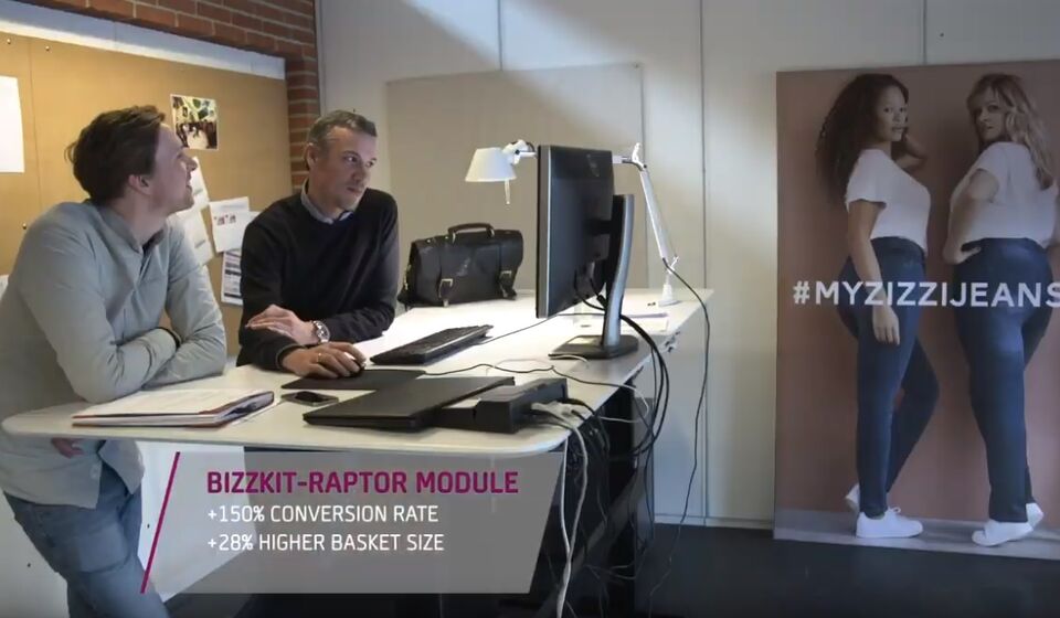
In close cooperation with one of Hesehus' regular collaborator, the recommandation-expert Raptor, a new personalisation tool, the socalled Bizzkit-Raptor module, has been developed and implemented on Zizzi's webshop.
The generic module, which can be adjusted and integrated on all our customers' webshops depending on the needs, is based on data mining, advanced algorithms and machine learning and can thereby make 1:1 personalisation for the webshop users based on their online behavior and in that way shape a more personal customer journey for the individual user.
On Zizzi's webshop the customers are now being introduced to offers, news and product suggestions not only based on what other customers have looked at and bought, but also based on their own history, preferences and behavior. An amazing tool, which can increase the cross and more sales on the webshop and has shown an increase in conversion on zizzi.dk on 150%. Moreover the module has given a 28% bigger basket size and 40% in ROI.
Learn more about the Bizzkit-Raptor module in the video.

Case details
Danish webshop launched in February 2015
Redesign i 2017, Bizzkit-Raptor modul til personalisering implementeret i 2018. Redesign in 2017, Bizzkit-Raptor module for personalisation implemented in 2018. Today also present in Sweden, Finland, the Netherlands, Norway, Austria, France, Belgium and Germany.
Platform
Webshop, PIM, DAM and CMS
Functions & features
Responsive design, stringent product structure, sophisticated search and Bizzkit-Raptor personalisation module
Countries
Denmark, Sweden, Finland, the Netherlands, Norway, Austria, France, Belgium and Germany
Similar cases
More B2C cases by Hesehus
Questions?
We are ready to help


